Consistent borders for text fields
Text inputs, text areas, grouped fields, and picker searches now share quieter borders that match the app's dropdowns and buttons.
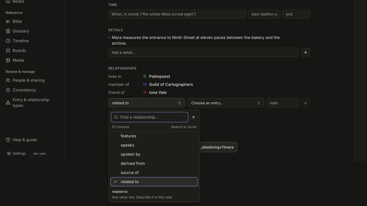
Text fields now use the same quieter idle border and hover treatment as the new dropdowns and outline buttons. This applies to normal inputs, text areas, grouped fields, and native selects. Search fields inside pickers share that card background and inset shadow too. Focus uses a thin colored edge instead of a large surrounding halo, while remaining clearly visible for keyboard navigation.
Normal inputs, text areas, and picker searches now share their surface styling, so future refinements stay consistent. Search, selection, and saved content work as before.